Thursday, 21 October 2010

CAMERA TEST, STUDIO DESIGN, LIGHTING PLAN AND LOCATION PLAN

Camera Test:

As our group are filming a real band a camera test was not necessary as we could not replace the people in the band. However what we did instead was go on to their website and copy some of their promotional pictures and placed them on our blogs. In doing this we could see that they would look right on camera and as they are a real band they will bring a sense of authenticity anyway. When we are filming, we will take into account that we need to have more close ups of the two girls than the man as they are more aesthetically pleasing for the audience. However there still will be close ups of the man as he has an interesting face which will be good for the camera.


Lighting Plan:

For our video we wanted to impose a vintage feel onto a modern scene. We would do this by using low key lighting on the set to make it look slightly older. When we were drawing the lighting plan we had to take into account that we were filming in a studio of which we were going to build a theatre within it. This meant that the set had to be lit enough for the audience to see the detail in the set, however we wanted it to be slightly dimmed to give a vintage feel to it.

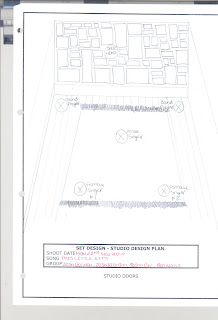
Studio Design:

We wanted to create an old theatre in the studio using different set designs; however we have now found a real theatre which will look more authentic. The studio design helps us to see where to position the cameras and also help us to see that shot's to use on the day of the shot.
.

Location Plan:

We wanted to find a place where we could make a bonfire so that the band could play and liaise round it. We thought that this would be visually pleasing for the audience and the idea of fire also supports the idea of danger in the lyrics of the song. We have found a Duke of Edinborough Camp where we will be able to make a bonfire and film the band around it. We have also found a new location to film the bands performance and this will look much more authentic than creating a set in the studio.

The new location was found for us by our lighting designer Dan. Dan worked at the location which is an old English mansion and was able to get the location for a very low price.

Wednesday, 20 October 2010

STORYBOARD


The storyboard is the way we planned our production. Films work through visual composition according to Khuleshov, who says that 70% of the meaning comes through the images. Filming is hard work and time consuming. Storyboards mean you have practiced all the shot composition and the cuts or mixes for the transition between shots, even before you begin to film.
We also not only drew our storyboards but filmed them and edited them together so we could see what worked and what did not in terms of shots, cuts and tracking.
As our group produced the storyboard we took into consideration what shots to use and why and why we use tracking and craning. We use storyboards to build an image of what we did in the timeline, so that we have a clearer idea of what the video is going to look like as a finshed product. Using the timeline as a guide we can also see what works and what does not.

Storyboards are vital. In the storyboards we worked out the types of shots we were going to use, camera angles, the colours and shapes, the mise en scene, the camera movements, the framing and the way we would edit. So in the storyboar we work ebverything out, we plan, we test, in the real world the storyboard artist costs alot less per day than the £1 million plus that the movie would cost.

So woth our storyboard we are trying to visulize, to work out what is on screen. If it works we will then shoot it and then we will edit it together just like putting a puzzle together.
Unfortunately our plan kept changing from our timeline to our storyboard. This meant our storyboard kept changing right up to the day of filming.

When we were composing the storyboards we took into consideration that the band had two attractive young girls and a 50 year old man. We decided that we were goint to do more close ups of the girls than the man however we are still going to shoot some close ups of the man as he has an interesting face.

For some of our shots we will be tracking a close up of a jack danials bottle with the band playing in the backround. This will give a vintage effect and will give an interesting points of view for the audience to view the band through.

We came up for the idea of bonfires when we were looking though the lyrics and the concept of danger came up. We aslo thought that it would be visually pleasing for the audience as well as the fire would look good on camera.

We are using a lot of close up shots in our pop video as well as. For example during a guitar riff we will have a close up of a the man or girl playing that guitar part. However we can not do this for all of them as it will become repetetive.


Tuesday, 19 October 2010

TIMELINE

When our production group were composing our timeline we were trying to create an authentic and vintage style, so it matched the bands image. We were trying to create a performance based pop video for the band so we could use establishing shots and show off the band as much as possible. The crucial thing about a timeline is that it establishes time within the pop video. It shows when the band does certain actions or things within the video and what type of shots we would use to do it.

The Timeline also shows when the band use their instruments and this would be shown by various shots such as close ups. The Narrative is also displayed within the timeline. An example of this would be the band crowding round a fire in the evening.

The band itself is made up of three band members. Two of these band members are two sisters who are in their twenties. The other band member is their father who is a 50 year old man. The two girls are on vocals and instruments so will be shot more than the man as they would be more attractive to the audience. As a result of this most of the shots will be on the two girls, however the man may have an interesting face so could be used a lot as well.

In our song their are a lot of guitar riffs and sections and for these we can not always use close up shots as they will become repetitive and boring.


Camera Test

In our pop video, we will be shooting a real band called 'The Toy Hearts' and producing a video for one of their recent singles 'This Little Kitty'. We did not feel that we had to get the band down to the studio for a camera test because we can not replace them if they dont look as good as they should. Instead of doing a camera test we have taken some of their promotinal pictures of their website and put them onto this blog. As a group we feel that they will look good on camera anyway judging by their pictures.


Wednesday, 6 October 2010

Composition Rules

Composition Rules:

Pop Videos, Films and TV programs all use images to put over meanings. These meanings can be used and conveyed in different ways to try and create a certain impression amoungst the audience. Kulshov say's that 70% of the meaning in film is through the images that are shown. For example if their is a high angle shot of someone so the camera is looking down on them, then this would suggest to the audience that they are being looked down on. There is a language of flim making that flim makers follow to put over a meaning. These are known as composition rules and there are over 200 of them. In this blog I explain 8 of these composition rules.

1. Different type of shot size


The different type of shot sizes include extreme close up, the big close up, the close up, the medium close up, the mid shot, the medium long shot, the long shot and the extreme long shot.

We use the extreme close up to make the audience more involved with the sequence and bring them in closer to the action. It is also used to shock the viewer and they can bring a new perspective to the story.

The big close up is the equivalent to staring someone in the eyes.

The close up delivers emotion from people and impact from objects.

The medium close up shows a shot of a person so you can see their shoulders and head in the shot. It is known as the ‘talking head’.

The mid shot shows more of the scenery around the subject however it is still close enough so that you can see their facial expressions and bodily gestures.

The medium long shot is good for showing the character and the location. This shot comes into use if you need someone walking through a door or is on the move.

The long shot introduces people at full length and creates a sense of place, time and atmosphere; showing interior or exte4rior or exterior, day or night.

The extreme long shot gives a clear picture of the landscape so the audience know exactly where the event is taking place of where something is located. It gives the audience the feel of the atmosphere although small details will be harder to show.
2. Camera Position and Angle.

Different camera angles and positions are used to give the audience a different point of view on certain events that happen throughout a film.


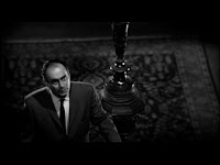
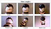
A high angle shot may be used to look down on someone making them seem small and the audience bigger. If it is a point of view shot then this will be the case for the bigger person. If a low angle shot is used then this looks up to the subject, therefore portraying them in more heroic way. Film makers stick to a 180 degree rule so that there is standard continuity among their shots as well. The significance of the shot is also determined by the size of the characters in the mise en scene. For example if the shot is a close up of a man’s face, then the most important thing happening is his facial expression.


3.Camera Movements

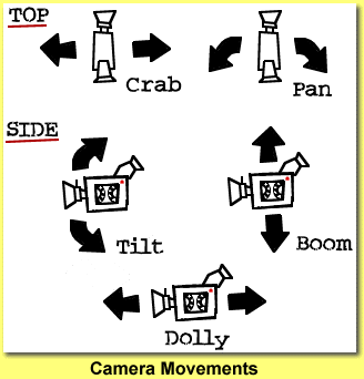
An example of this would be tracking and crane movements. Crane movements are when a camera is place on a crane and then the scene is shot from a high angle and the camera can be controlled easily. A tracking shot is when a camera is placed on a track so that the camera can either move from left of right but keep the same perspective. This is helpful if you are shooting along side someone who is walking. Tracking also allows shots that are too wide to be covered in one shot to be covered by moving the camera at a steady pace.


4.Rule of Thirds

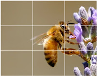
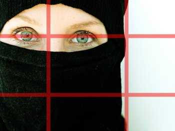
The rule of thirds is where the shot is divided up into different sections. Depending on the importance of the object depends where it is in the shot. For example something of high importance would be located at the top left hand of the shot as we sub-consciously read the screen like we would a book and this is the first point that we look at and examine. Film makers also use the screen on the basis that it is a XY axis. If someone was to walk from the left and side of the shot on the x axis then this would infer that this subject was good or the hero of the film. If someone was to walk from the right hand side of the x axis then this would infer someone bad as they are walking against the direction that our eyes read the screen.
Breaking these rules can be done on purpose to put over a particular meaning to the audience as well. By using these specific rules this helps create a balanced and professional looking picture.


5. Leading the Eye

Leading the eye can be used to put over a meaning to the audience. If the camera is following a subject through somewhere, then the eye tends to focus on that point. If someone walks from left to right this normally means they are good according to the x y axis rule, however if they walk from right to left then they tend to be bad as they are walking againgt the flow of the eye.


6. Colours

The colours of a set are very important for setting the mood for the scene. Both the foreground and the background colours are very important for how the audience perceive the picture. Different colour can bring out different emotions and qualities within the mise en scene. For example the colour red will show personality as outgoing, active and physical. The positive qualities of red are motivating, warm and caring however the negative qualities are that its irritable and angry. The colour white on the other hand brings out masculine energy in its personality, purity and cleansing in its positive qualities and cold and isolating in its negative qualities. So if a director was trying to create hell in his film then, he would probably make the background red as it is irritable and angry. In the film ‘The Wild Bunch’ the movie is shot with a filter that creates a dingy effect. A way of creating this effect is to put a pair of women’s tights over the lens of the camera that it creates what is known as a ‘poor mans filter’.


7. Editing Styles

Editing can be used in different ways to create different effects. For example if you increase the speed of editing then this increases intensity. This would be used in something like a car chase or a fight scene. The film ‘The Wild Bunch’ uses what is known as balletic editing. For example they get a shot of someone being shot of a roof top, while he is falling the mise en scene quickly rotates through another series of shot’s of people doing other things. The scene will then cut back to the man falling down still and this process continues until he hits the ground. Other editing styles include dissolving and fading.


8. Shapes and Lines
The shapes and lines of a set can also help set the mood along with colours. To get a dangerous effect and to make the set look uninviting more uneven and jagged shapes will be used. For example Gotham city in Batman will be made to look like it is dangerous and run by criminals so the set design will be more uneven and jagged. To make a place or a set look more inviting then curvier and smoother objects will be used to create the set. This gives a safe and more inviting feel to it and makes the audience feel safe.