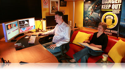
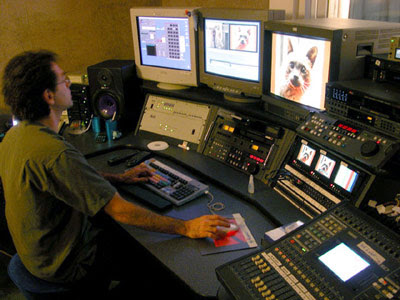
 The first step we took to actually editing the video was to lay down a wide shot of the whole song and inter cut from there. This however proved to be difficult as our video was constantly spinning so we needed to cut on the black. This led to a number of problems such as wrong timings and different colour shades, but we managed to find a way around it using techniques such as dissolving the clips and speeding them up so they would be in time. We did not use our storyboard as our idea had to change at the last minute because we lost our location on very short notice. We went about the editing to try and make it creative and original but at the same time so it would work.
The style of music we are making a music video for is bluegrass and this is typically different from the usual types of pop videos. This meant that because our music was different and unusual our video had to match that sort of feel. Because our location was taken away from us on short notice we decided to go for a minimalistic approach to our video.This meant that we needed to think of an interesting concept, so we came up with the idea of rotating the camera clockwise in the middle of the band who would be surrounding it. The meaning of the song is about a girl who is reckless in her approach to life and is all about having fun. We needed to support and convey this meaning through our pop video which meant making it fun as well as minimalistic.
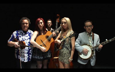
The band we were filming are a real band and they already have an ‘image’. This is a vintage feel with a modern twist, and we had to try and express this in our video. This is a shot of the whole band before they bow. We panned across them to keep the continuity of the video. This is the last shot we see and therefore will be the last image of the band in the audiences mind. This shows the certain style of dress that they wear which is clearly modern clothing.
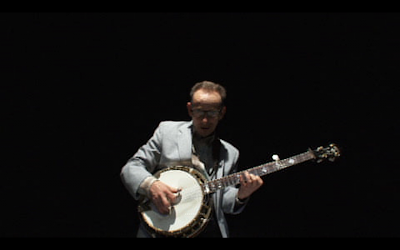
With the photo below of the man playing the banjo we again panned the shot from left to right. So at the beginning the man appears from the right hand side and moves to the left as we filmed it clockwise. This was to try and make the band seem more rebellious as they are appearing against our eye line that we naturally read along. This is one of my favourite shots of the video as it portrays the bands image further by having an aged experienced musician showing his passion for music through playing his instrument.
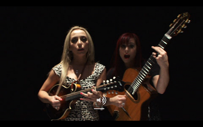
The next shot displays two girls that were in the band playing together. They again appear from the right of the mise en scene, suggesting that they are disobedient and careless which helps add to the whole bands image and the meaning of the actual song. These two girls will also be selling points as they are young and attractive to men so this will again add to the appeal and interest of the band.
The next screen shot displays one of the girls in the mise en scene twice using the edge wipe function on Final Cut Pro. We did this a lot in our video when editing to make the shots work. This also makes the video seem more interesting as it confuses the audience but it is the pleasure of the unexpected.
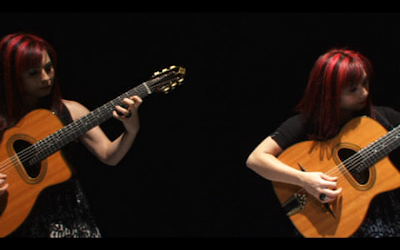
Continuity editing is when everything co-ordinates with itself and all the shots are cut to the beat. In some cases the shots will not be cut to the beat but say if the first one was a second after the beat, then in continuity editing the rest of the shots would be a second after the beat as well. Discontinuity editing is when things are different. For example if on shot was cut to the beat then the next one will not be. This can create a more interesting video as sometimes continuity editing can make videos look very robotic with not much flow, however discontinuity editing can create different and more exiting and overall give a more natural and human feel. We therefore in are video used discontinuity editing to try and make it more aesthetically pleasing for the audience. An example of the discontinuity editing is the picture above where the same person is in the mise en scene at one time. The picture above shows the discontinuity of our editing.
According to Keith Negus there are 11 key areas and common generic conventions that should be used in pop videos: The explicit and unashamed promotion of the artist’s image is the first one, and we have tried to do this trough are video by using 360 pans of the band members. We used wide shots, mid shots and close ups. The second one is the featuring of the artist, which we have done explicitly by using close ups, mid shots and wide shots. This also covers the third point of using extensive shot types and movement. Almost all of our shots are moving, with a small number of exceptions. We also have repetition of reoccurring thematic elements (using the 360 pan constantly). In our video we do not have a narrative structure, but we use a performance element the whole way through. We have definitely used the flexibility to disregard realism by using the same person in the mise en scene. We do not have many shots that cut tightly to the beat of the track and no real use of special effects apart from lighting tones. We have a carefully constructed mise en scene, by having unusual sequences and distorting cuts. The last of Negus’s conventions is high impact instantly.
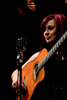
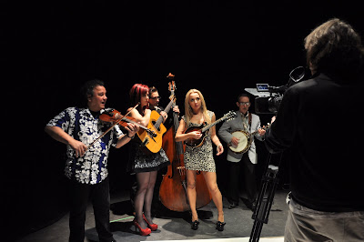


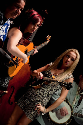 Overall I thought that our shoot day went really well and even though there were problems we faced them and dealt with them quickly. Considering our idea changed at the last minute we were very organised on the day despite running over time a little bit. Most of the shots we filmed looked good and our group was happy with them.


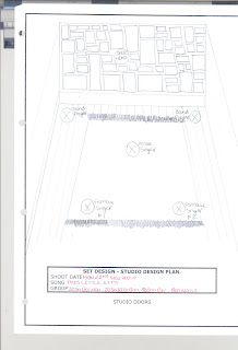
 When Dan, our lighting designer, came to talk with us about our video he suggested various ways of building a theatre in the studio using various props. We went through lots of different options of set design and we came to a decision about what to use. We also talked to Dan about what style of lighting we wanted to use. We said that we would like a sepia effect to make the video look more vintage so he suggested that we use certain lighting effects on the day and special filters to put over the camera lens.


 Studio Design: